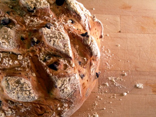
Many holiday seasons I make a few dozen of these loaves and give them to family and friends. Toast thick slices and slather with warm butter for breakfast. IF there is any left, use it to make and extra-rich bread pudding. Don’t worry about counting calories when eating this luxurious bread!
The following recipe makes 2 loaves
(more…)
I can’t recall the exact moment I fell in love with cooking, but it was early in my life. My mom has always guided the development of my of talents and learning my way around the kitchen was no different. One of my earliest recollections of cooking is making a single fried egg in a small pan. I could barely reach the stove, even when standing on a kitchen chair. I think most of my siblings have that memory (and possibly used the same pan).
(more…)
You know the saying “A cobbler’s children wear no shoes?” Well, it’s always the case that I’m last on my list to produce a website or logo for myself. And I’ll tell you the past few years have hardly made me want to do it. I’ve been through some knock-down experiences of loss–including losing much of my design work when two external hard drives fizzed in the Arizona heat. After that it just seemed an overwhelming and impossible task to conjure up any work I’d done when people asked for a portfolio.
But everyone loses things and the best thing to do is to be resilient. I think one of my best God-given qualities is the ability to “bounce back” through creativity. So I finally set up this website and just a few days ago began loading it with anything I could find attached to my Gmail or Facebook accounts. Then I sat down and doodled a logo to represent myself.
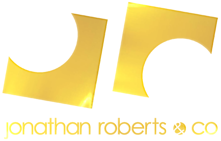
How do you even go about creating a symbol to represent who you think you are? I mean, am I a designer, a singer, an actor, a dancer, a chef, a producer, a gardener, a Sign Language interpreter, or something else…? What kind of symbol could denote all of those things?
My process for designing a personal logo was experimental and playful conjuring up images and words that I liked and felt represented me. I thought about using hands as a symbol (a friend recently said she felt my new path was more focused on using my hands than singing) and even scribbled several on yellow sticky notes. Laying all the yellow squares before me on the coffee table, I was hit with a eureka moment recalling a childhood memory.
When I was in Kindergarten our teacher was a wonderful young lady from Hawaii named Mrs. Mary Brown. She noticed my aloofness to formal education and my propensity for perfectionism and she took special interest in me. One time we were working on our motor skills through an art project (the kind of thing that kept me interested in school–I was already ditching classes at age 5). We had to cut circles from squares to make wheels for an image of a wagon. I tried my best but was soon frustrated when my circles looked more like exploded or deflated balloons.
However, Mrs. Brown was able to help me see the good aspects of my accomplishments by pointing out how smooth many of the edges were. Or, stating how impressed she was that my bright mind had figured out if I cut the corners into octagons and then trimmed those corners and repeated the steps that I would eventually end with a perfect circle. Ultimately, she reminded me that my goal was not to have “perfect circles” but to create wheels for the wagon. I’m amazed 30 years later I am still learning from my kind, wise Kindergarten teacher.
So, in my logo I designed circles cut from squares making the letters “j” and “r” for my name. It is a symbol that being open to possibilities in the creative process is what keeps us moving (much like a wagon) toward the goal. – JR
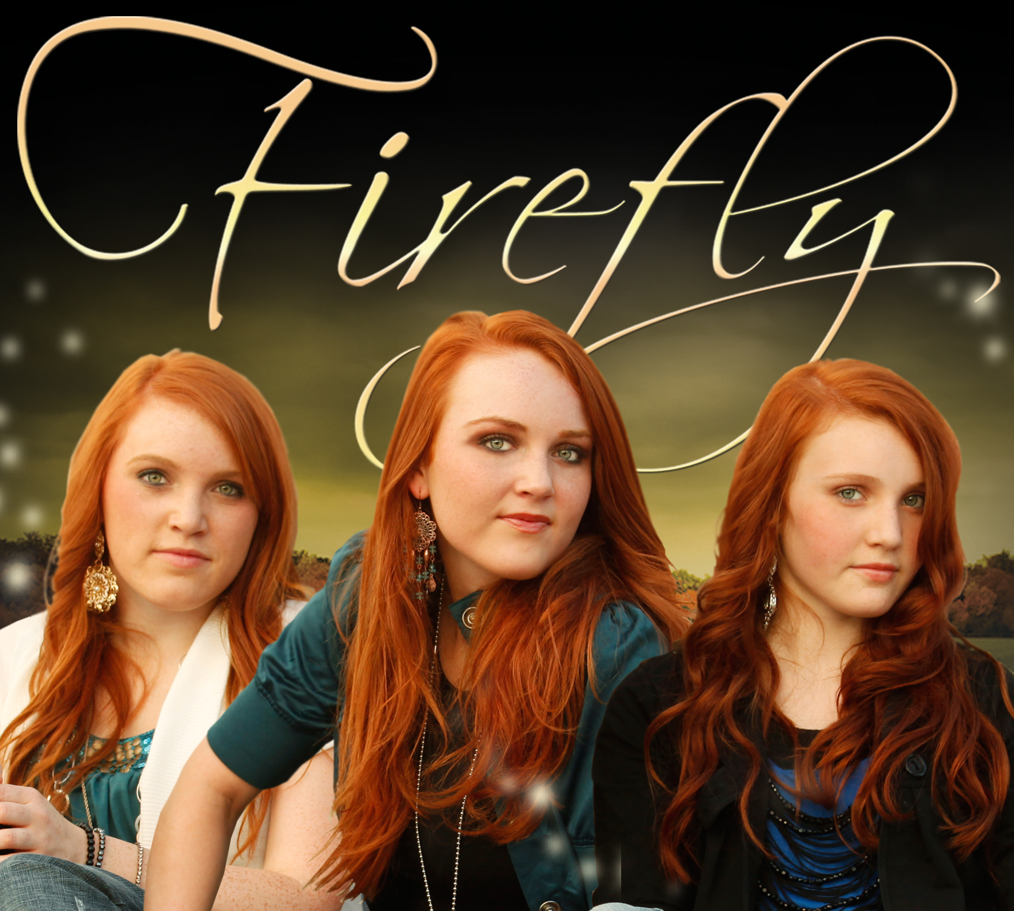
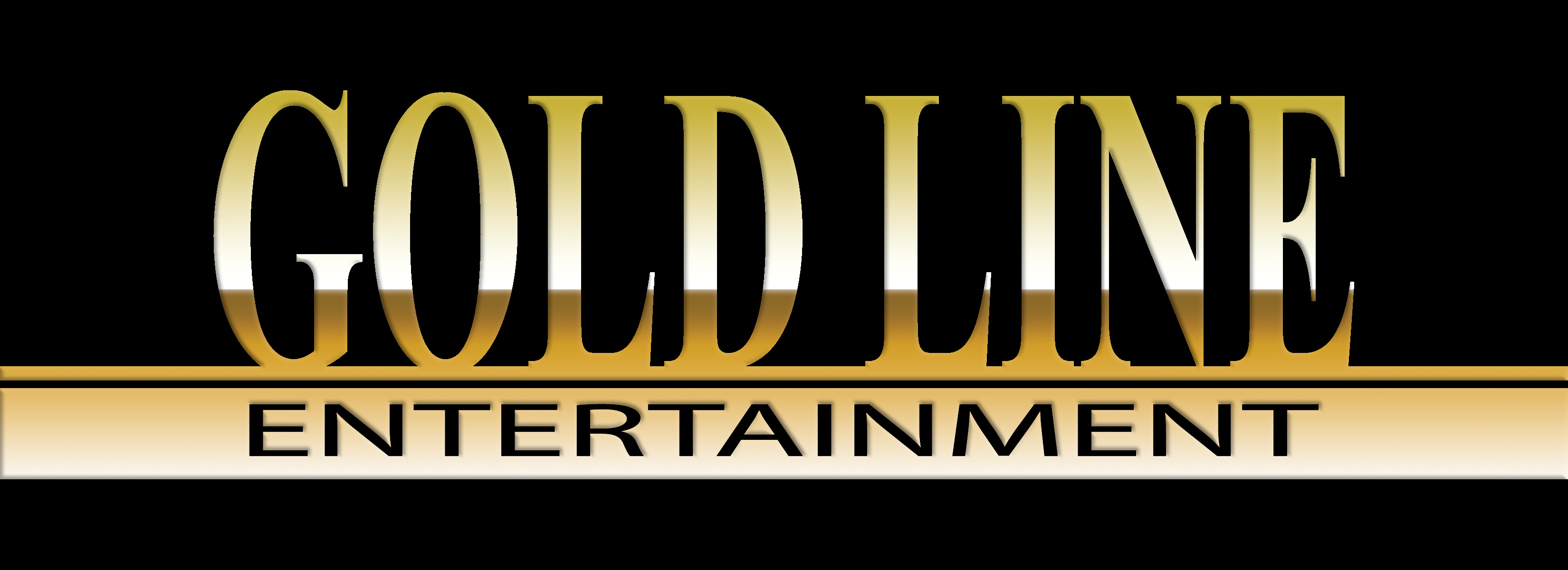
When I was working with Pop Country band Firefly, Cindy Goldney jumped aboard the management team as Booking Agent. She had formed her business but didn’t have a logo. I came up with this emphasizing the color gold and the word entertainment in a solid “gold line”:
In expanding Firefly‘s reach and fanbase, I created social media accounts for Facebook, Twitter, YouTube, Reverbnation and Flickr (this was also when MySpace was still desirable so I did that too). No matter where you went on the web, Firefly once had a distinctive visual brand that matched their message. Every web address or profile name is easily remembered as “iheartfirefly.”
Over time, each website has changed its functionality, appearance, and user audience. Additionally, Firefly was given responsibility to manage their own accounts so none of the pages look as they once did when everything was streamlined in the visual brand I created for them.
Whether use at 120×120 pixels or reduced to 16×16 pixels, the idea was that you could still identify them by their logo and faces anywhere on the web. Here is the profile picture most often used by Firefly on each account: