I have been singing since far before I can remember and have been fortunate to share the stage with great performers such as Wynonna Judd and Marie Osmond among others.
I also apply my branding and identity services through artist development empowering other people pursue their passion for singing, too. On ILoveToSing.com, I blog about the people I meet–singers and those in supporting roles in the industry–as well as promote contests, talk about what’s trending, and provide resources and products for personal or professional use. I am fortunate to have a great website name and have loved applying my graphic design skills to create a visually appealing brand for ILoveToSing.com.
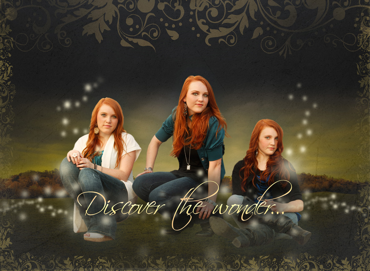
Check out some of the design work I’ve done to create and maintain a consistently strong visual brand.
(more…)
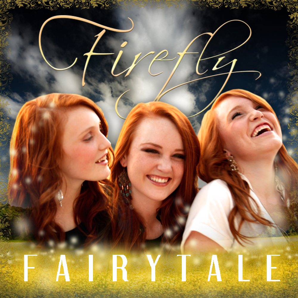
iTunes requires artwork to be submitted the same time as music so everything can be registered as a bundle. We had the music but needed artwork so here is what I came up with using elements of their visual brand design portfolio.

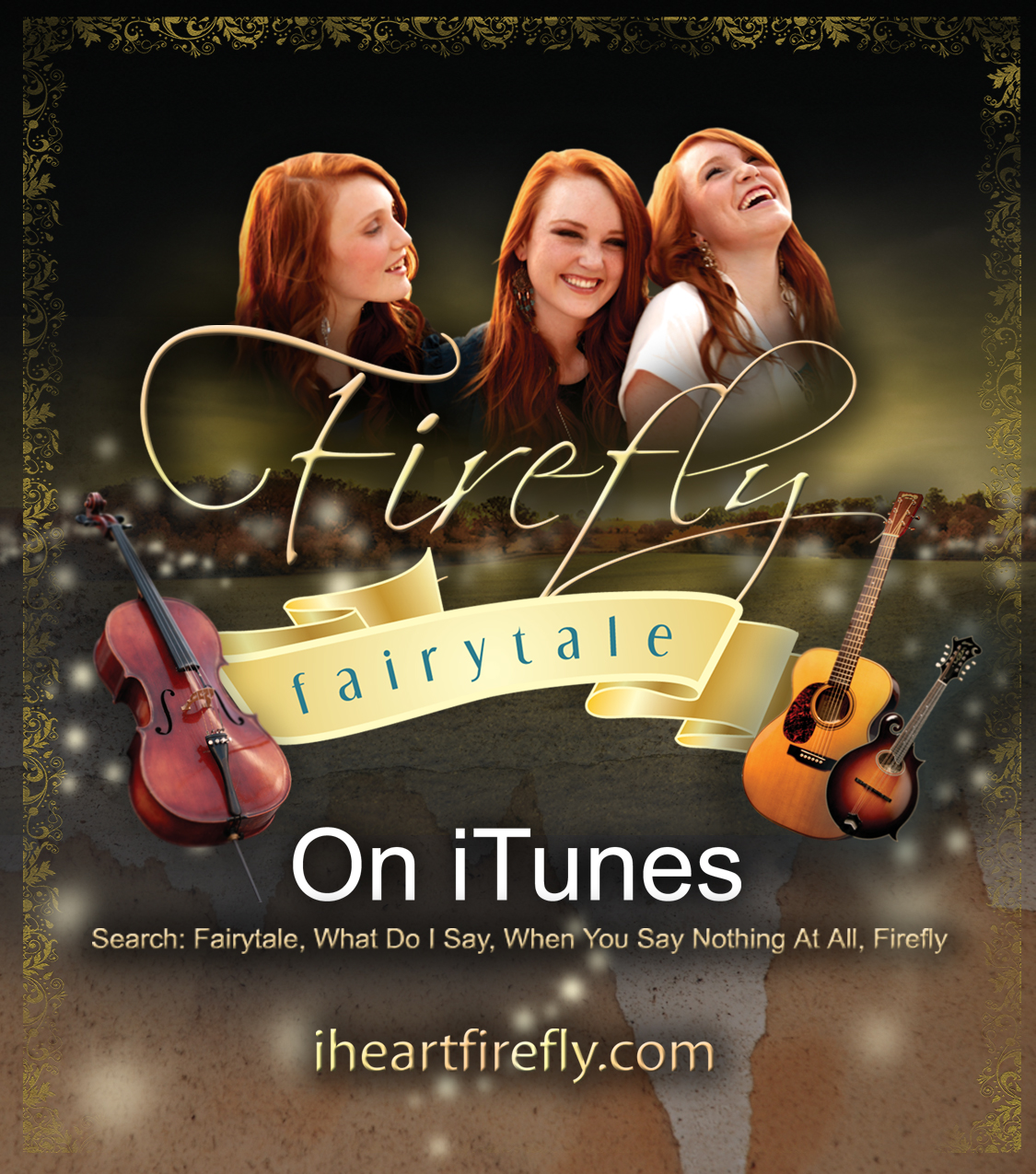
When Firefly got their first tracks loaded to iTunes it was very exciting but we knew they needed something tangible to remind fans to go home and download their music after seeing their show. So, I created these printed cards:

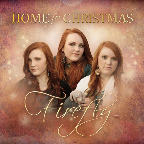
Later, Firefly decided to release a Christmas single and we kept the iTunes artwork within the parameters of their visual brand:
Many times the first impression a person gets is what they see of an artist before they even hear them sing. So, I invest greatly in helping artists convey the message of their brand visually.
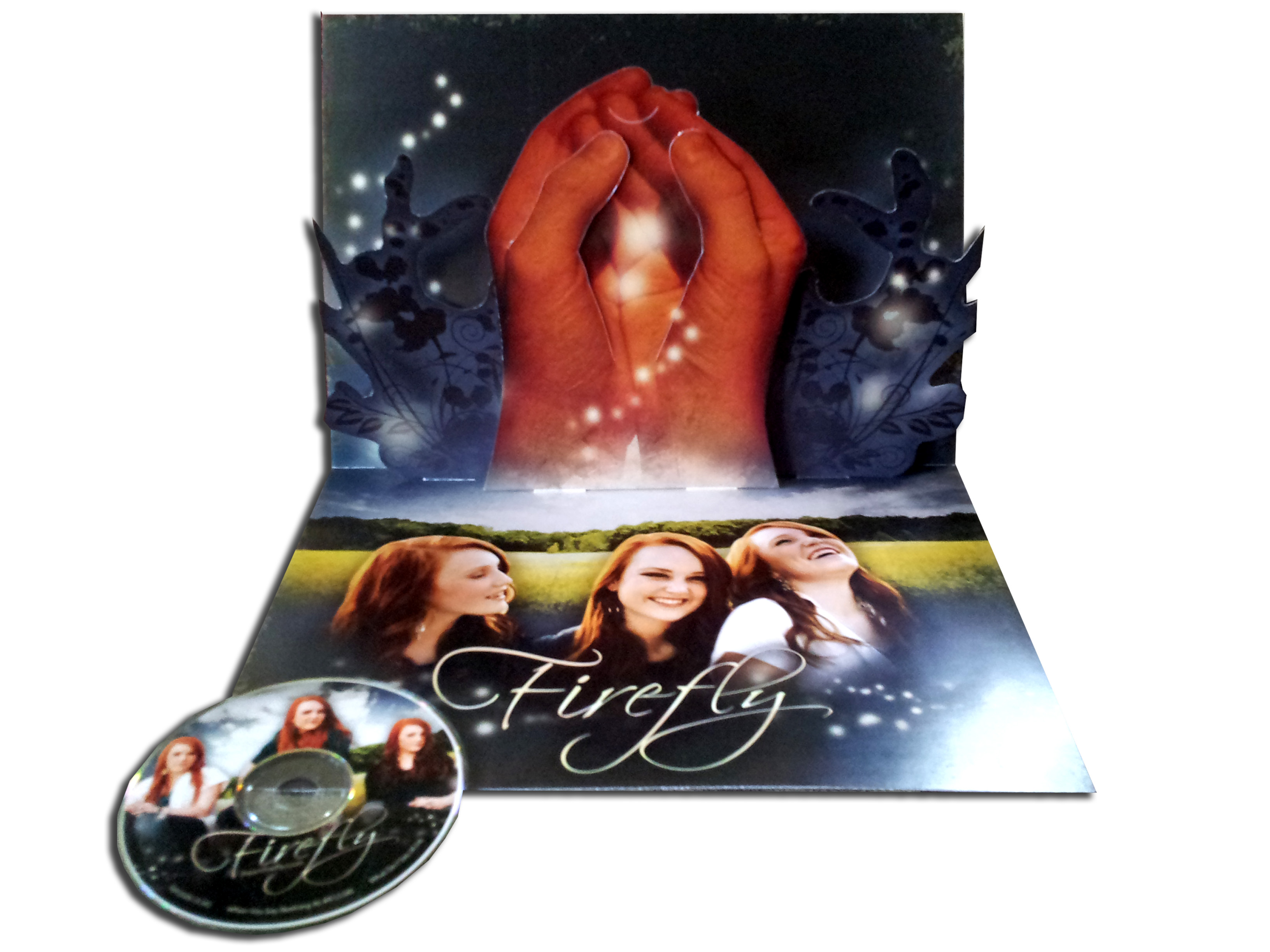
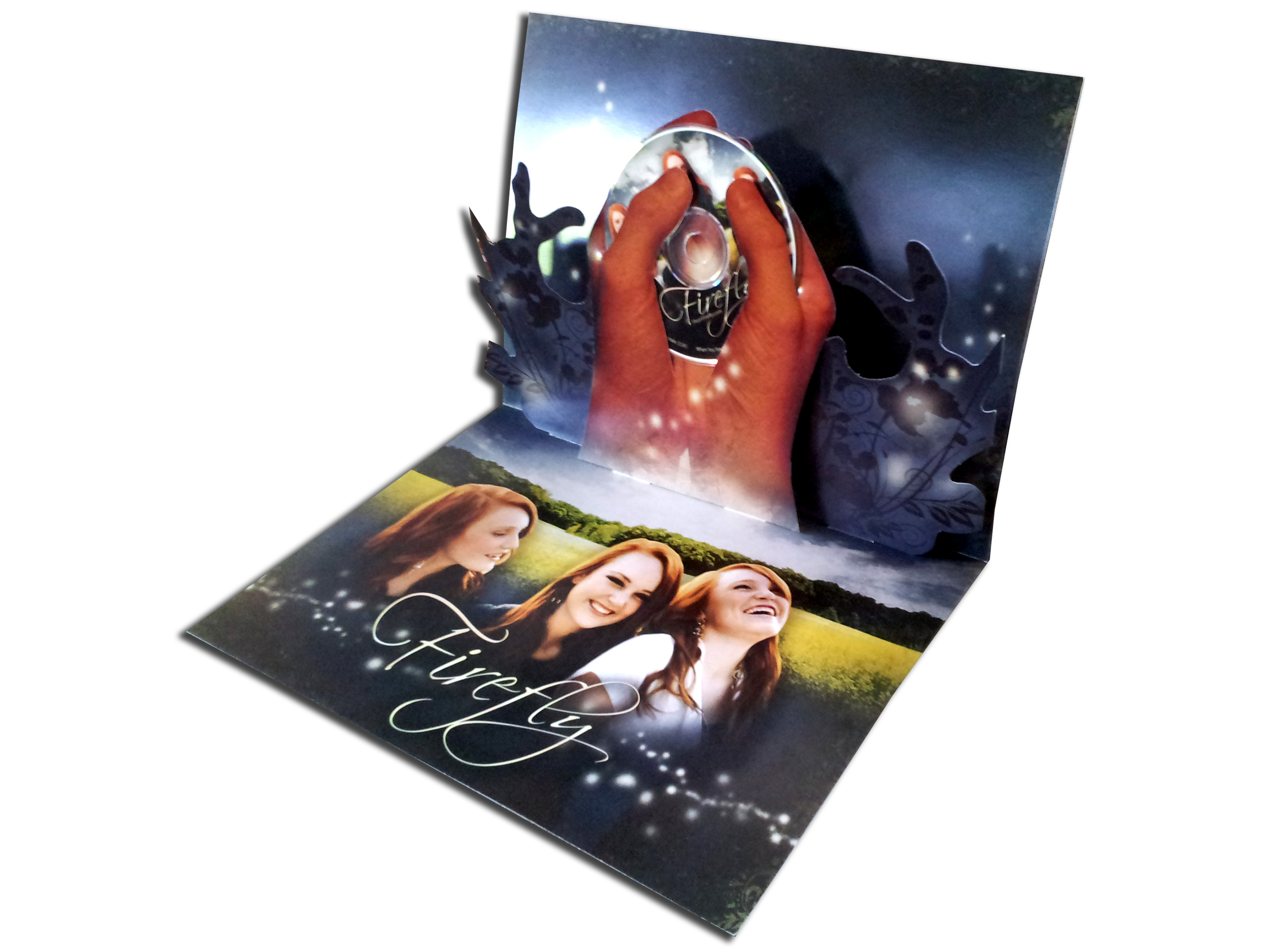
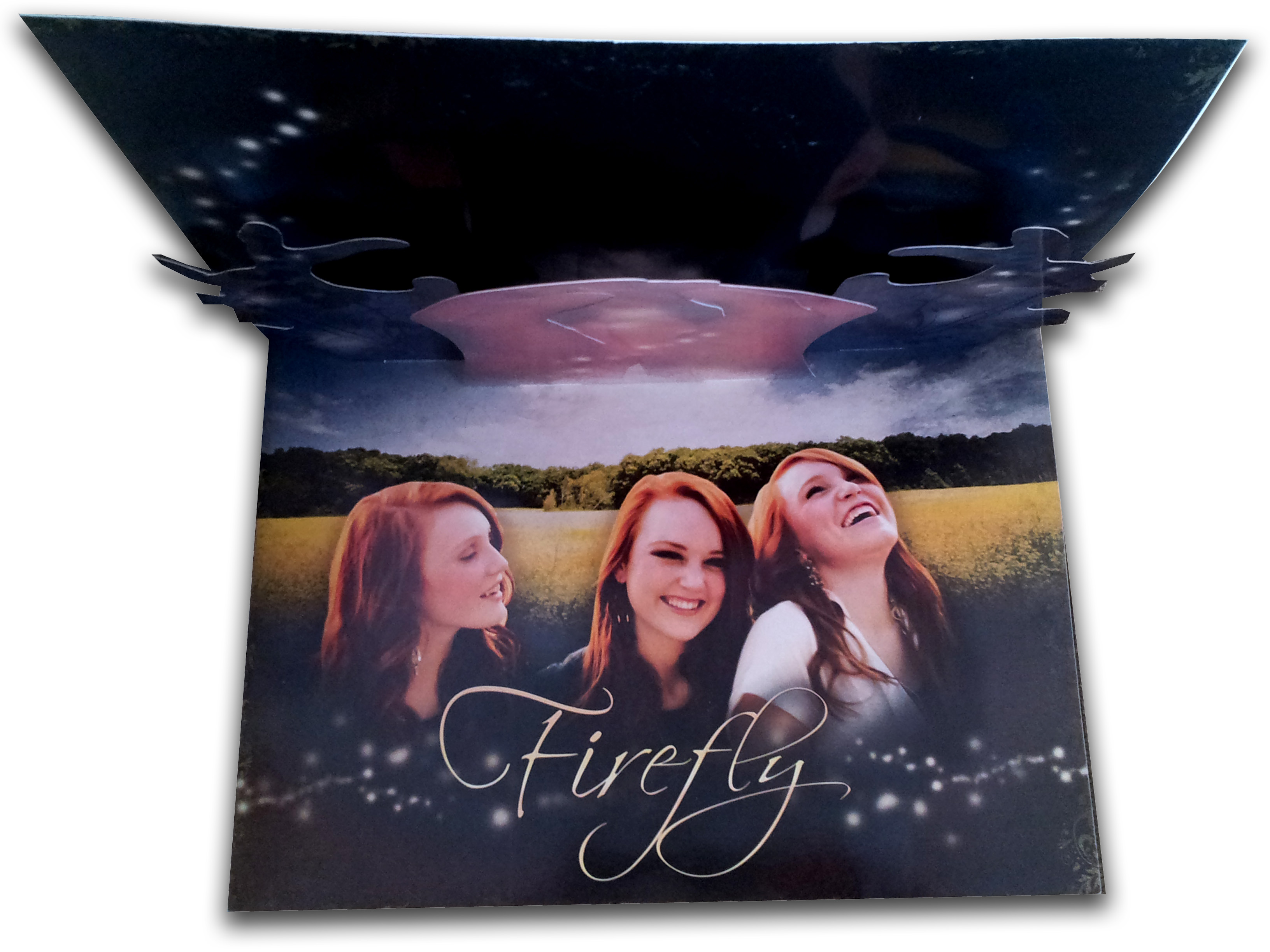
This is one of my favorite hand-crafted projects I’ve created to promote a musical act. I came up with this “pop up” press kit when thinking about Firefly‘s song “Fairytale.” I wanted to present their pictures, music, and story in storybook fashion to potential investors and producers and quickly impress them. (I’m glad to say it worked!)
Each kit is made of 3 sheets of heavyweight 18×13 inch paper and a CD. When folded flat the kit measures 13 inches wide by 9 inches tall and is about 1/4 inch thick. All cuts were made by exacto knife and pieces folded assembled with glue then the kit was shrink wrapped by hand.
Front Cover:

Inside with cut/score lines for internal stands (See how these are made and operate, click here):

Inside assembled with hands and flourish components:

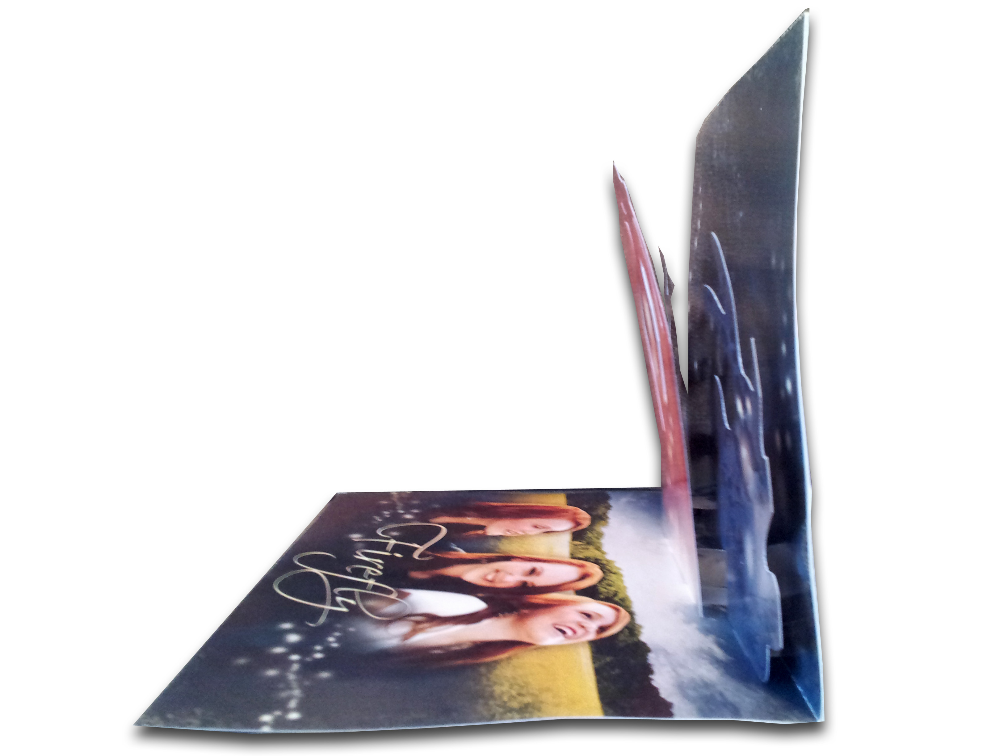
Inside from an angle to see pop up elements:

Inside Above:

Inside Side View:
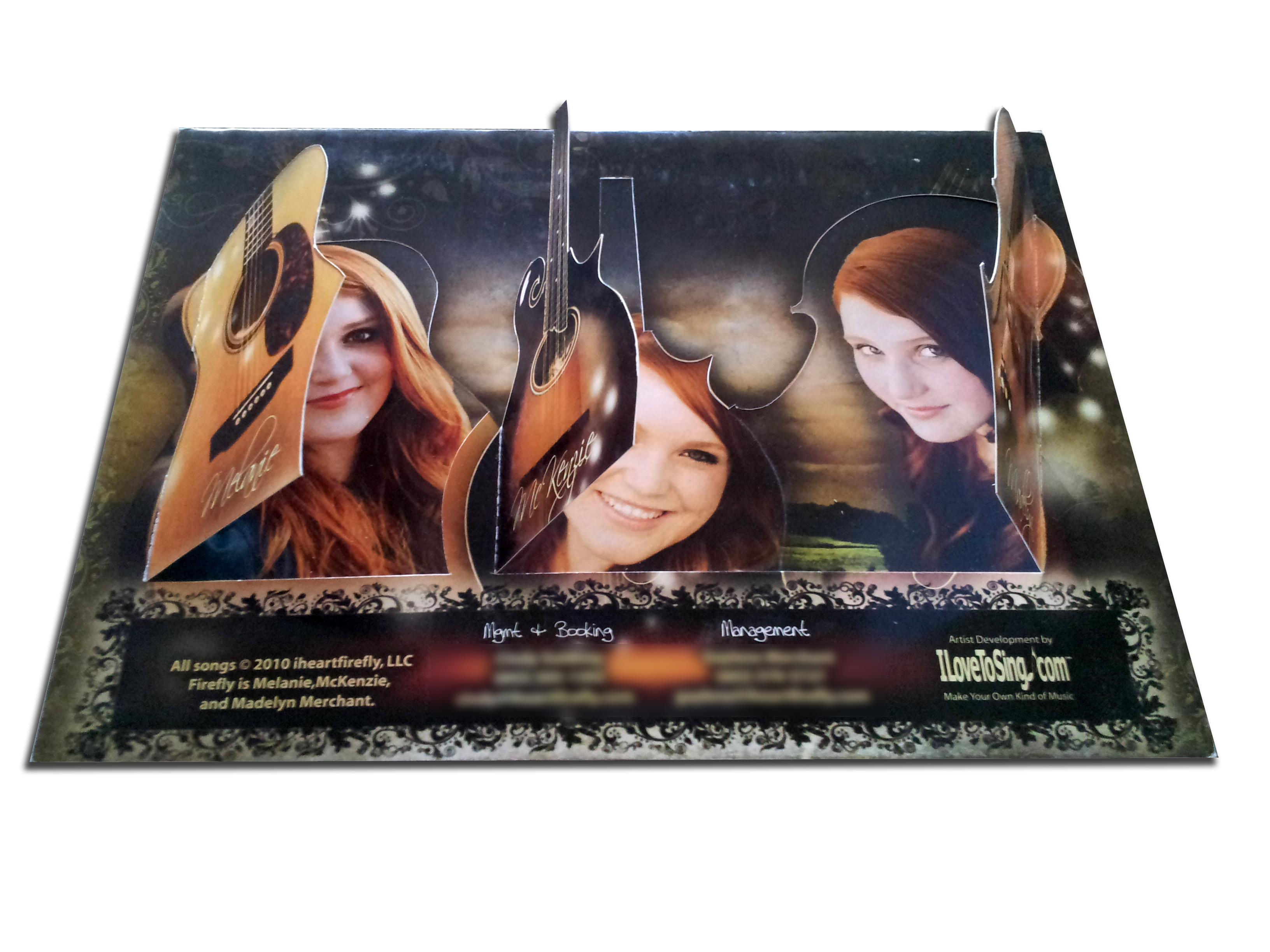
Inner Layer of the Back:

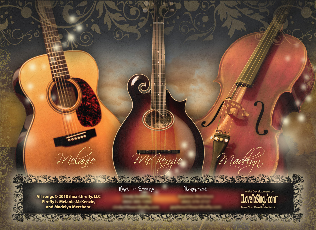
Back:

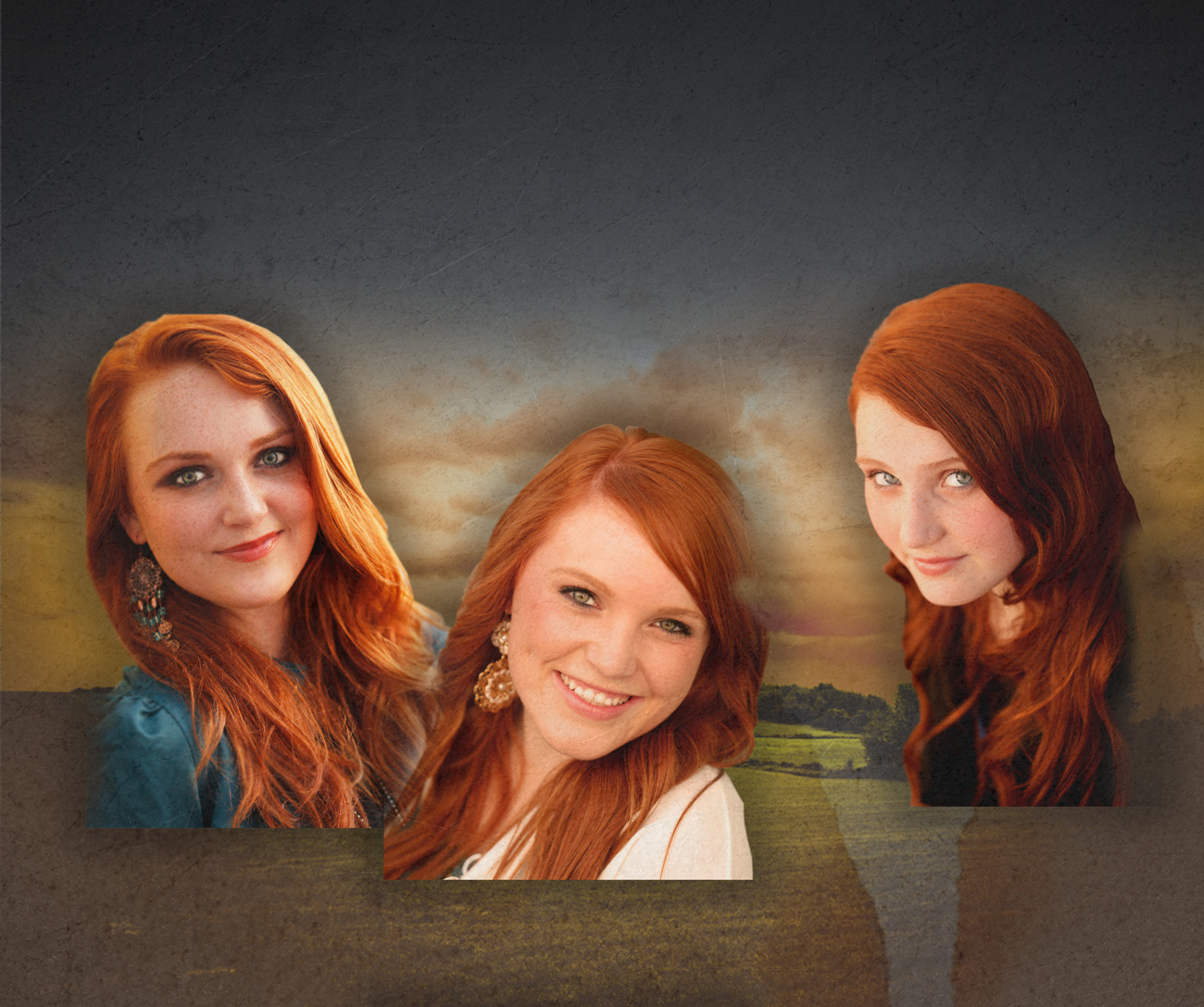
Back with windows open to reveal faces of Melanie, McKenzie, and Madelyn behind the main instrument they play:
What kinds of things do you do to develop a visual part of a message? Is it graphic design, fashion, choreography, Sign Language, etc.? I’d like to know what you are doing. Thanks! – JR
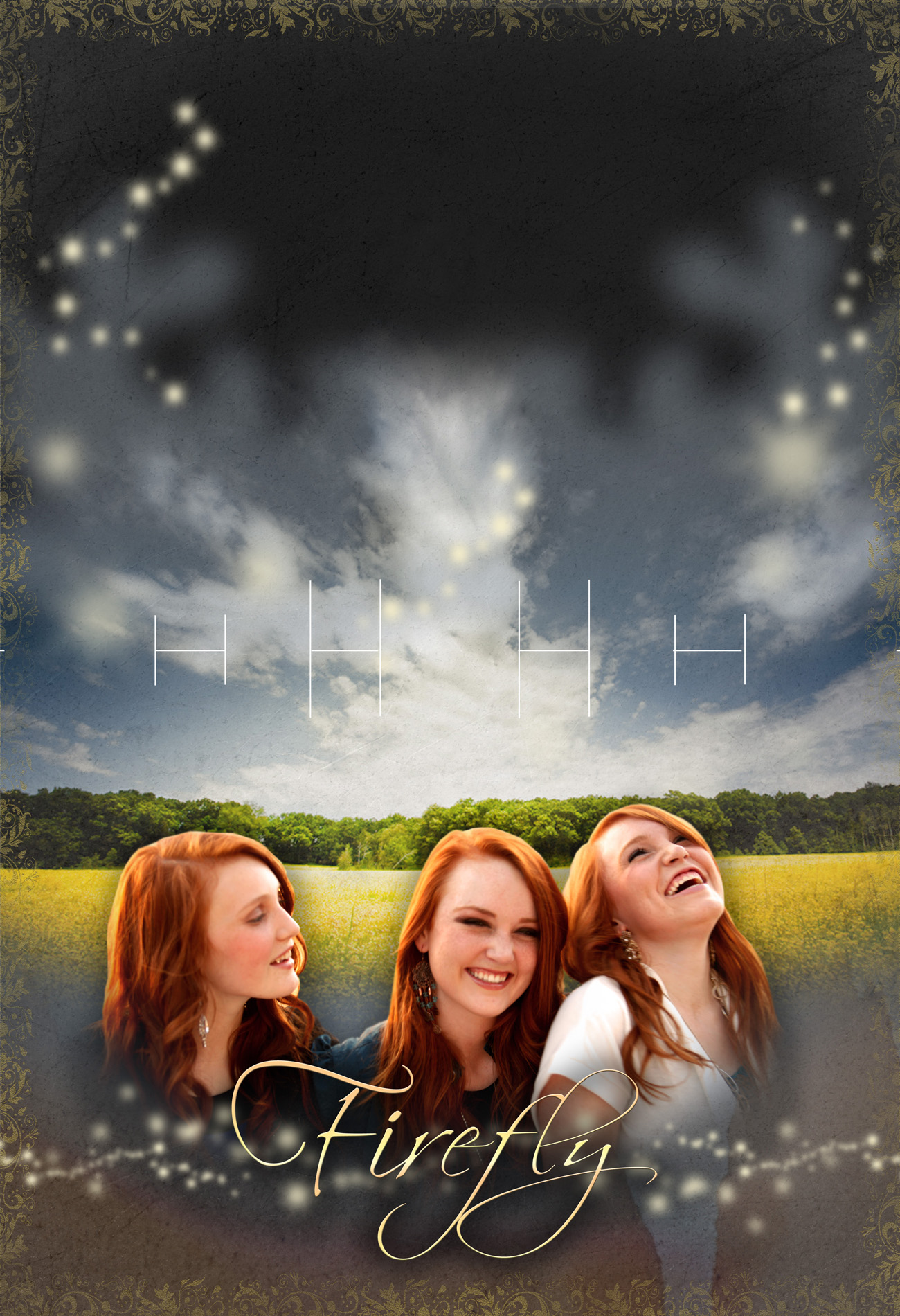
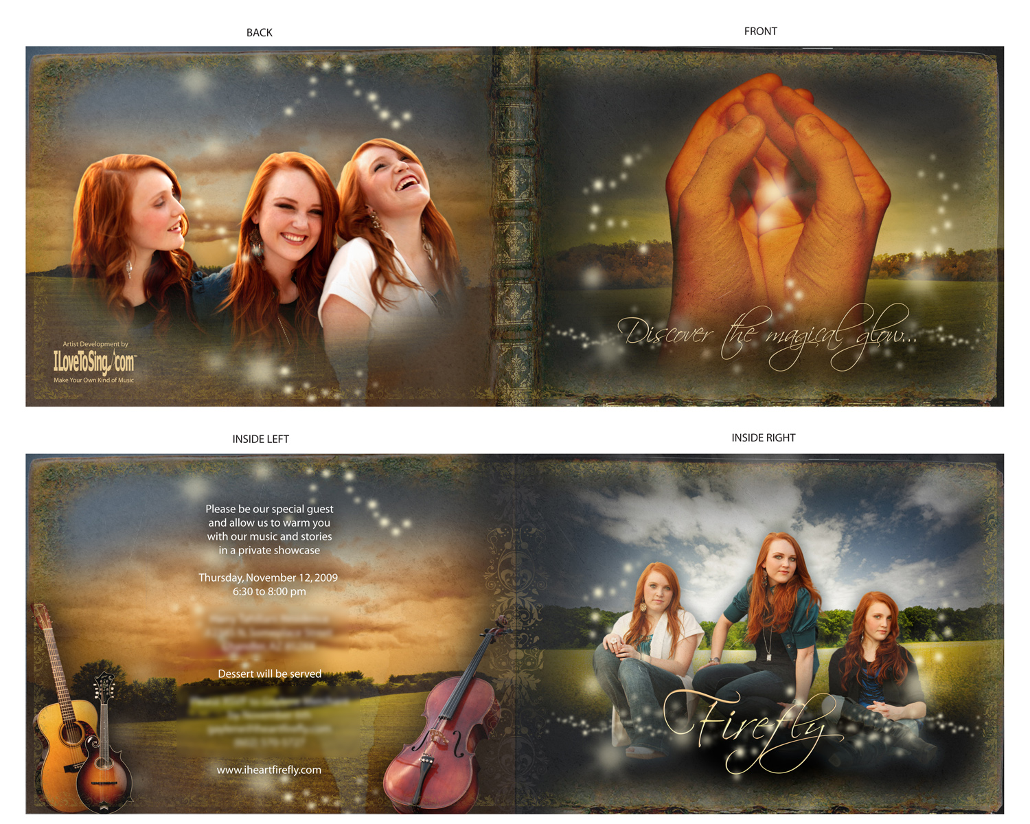
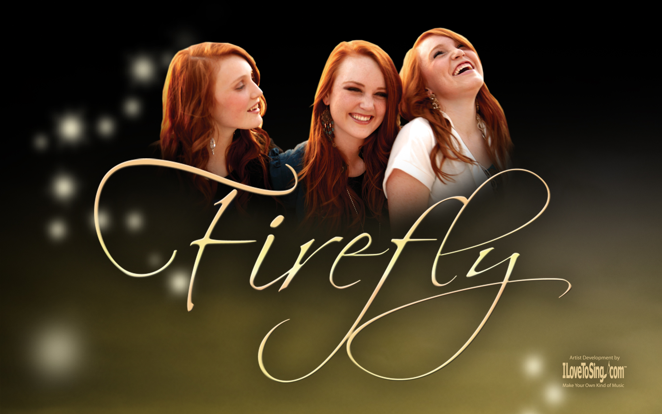
In 2009 I produced a fundraising private showcase for Country Pop sister trio Firefly. This printed invitation features new artwork, color palette, and the new logo. Photographer Mark Mabry took shots of Melanie, McKenzie, and Madelyn. I knocked them out in Photoshop and layered images of landscapes, firefly lights, book ends, borders, and instruments. Those are McKenzie’s hands that we got a rough shot outside. I also cut it out in Photoshop. Each layer was given a drop shadow. Then everything was passed through warming filters with increased contrast. It sounds so simple now but it took hundreds upon hundreds of hours to create every element of Firefly‘s visual brand.


Melanie, McKenzie, and Madelyn Merchant are the oldest of 7 musical siblings from Gilbert, Arizona entertaining audiences from Arizona to New York. By 2006, Melanie had become a featured singer-songwriter and opened with an original song for a benefit event honoring the legendary Wynonna Judd. In the Summer of 2007, they formed their country-bluegrass band Melanie and Firefly to perform during Writer’s Night at the world-famous Bluebird Cafe in Nashville, Tennessee. They went on to share the stage with The Gin Blossoms, Ryan Shupe & The Rubberband, and Benton Paul later that year.
As they developed their sound, they were influenced by artists Michelle Branch, Martina McBride, Taylor Swift, and John Mayer and quickly moved from Bluegrass inspired Country to Country-Pop and they shortened their name to just Firefly. This sound coupled with lyrics of fairytales, hope, love, and light became known as the Firefly sound.
In October 2009, they set their goals to raise funds to further their music careers and they asked me to produce a concert for private investors. We held it in the backyard of a very influential Phoenix philanthropist. In organizing the event, my roles were vocal coach, event designer, graphic designer, and publicist.
Unfortunately, I lost several hard drives a few years ago due to heat and I have no pictures of the evening. However, I have pieced together files from my email attachments of the graphic design elements. I created a new visual brand (here’s the old one) to tell the story of their message as a group sharing light to a world in twilight.
Visual Brand Components:
- New Logos
- Website
- Invitation (Print Version)
- Invitation (Email Embed Version)
- Fundraising Proposal
- Pop-Up Press Kit
- 8″x10″ Full Color Autograph Sheets
- T-Shirts and Merchandise
- Stage Banner
- iTunes Pass-along Cards
- Social Media Pages and Profile Images